
How to spend $119 billion?
How much does it cost to keep the lights on at Meta and sustain its growth? A lot. I designed a forecasting tool that cut modeling time by 80% using object-oriented UX.
Finance and infrastructure leaders can now quickly build forecast scenarios and present them directly to Mark Zuckerberg and other executives.
Some images have been redacted for privacy reasons.
In 2024, Meta allocated an unprecedented $35-40 billion for capital expenditures, mainly to accelerate its infrastructure for advancing its AI capabilities.
ForecasterX is an internal tool that uses machine-learning models to transform Meta's complex data center, server, and network specifications into clear financial and energy projections. The platform empowers executives to make high-stakes decisions about where to invest resources, which hardware to purchase, and how to grow their operations—all essential to supporting Meta's AI ambitions.
The visualization below showcases capacity forecasting measured in energy (gigawatts) and investment (capital expenditures or CapEx), alongside other key cost and resource metrics.
This forecast, while visually straightforward, actually involves many people (infrastructure and finance teams and ML engineers), many iterations, and many reviews with stakeholders and executives. It then receives final approval from Mark Zuckerberg before becoming the official quarterly plan of record.

Many people

Many iterations

Many reviews
The extensive workflow—which ultimately drives all capacity planning decisions—creates a significant operational burden.
We need to enable infrastructure and finance teams to create forecast scenarios independently by modifying inputs, running the model, and comparing changes against the baseline without requiring extensive ML engineering support.
Scenario creators can then select optimal forecasts for leadership review, with one ultimately becoming next quarter's baseline forecast.
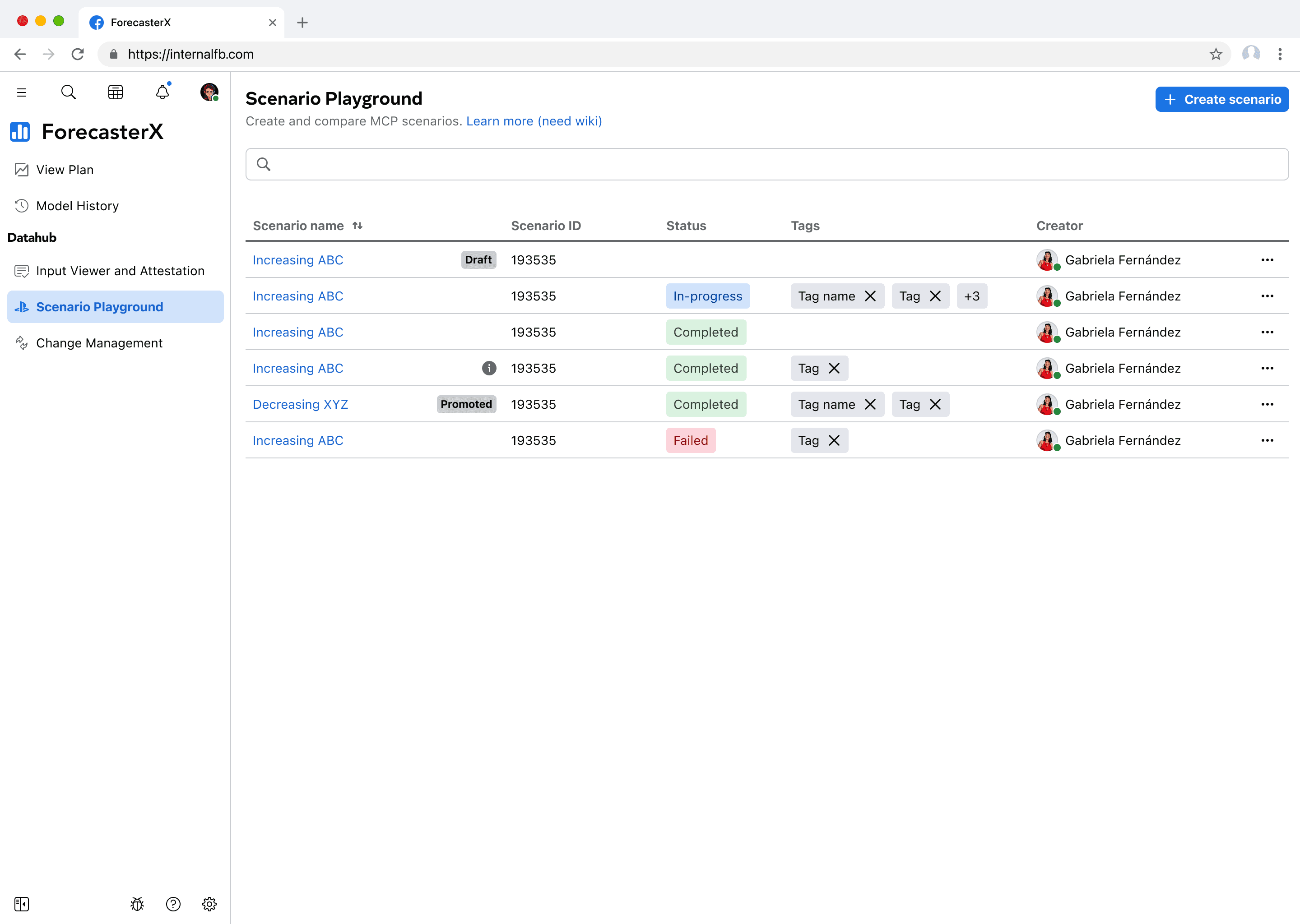
When I joined in December 2023, I encountered an existing proof-of-concept called "Canary service". The naming is indicative of the challenges to come.

Using the "changes to test" button, users can select an input data to edit as JSON on the right text box. When they are done, they click on "test changes" to run the model.
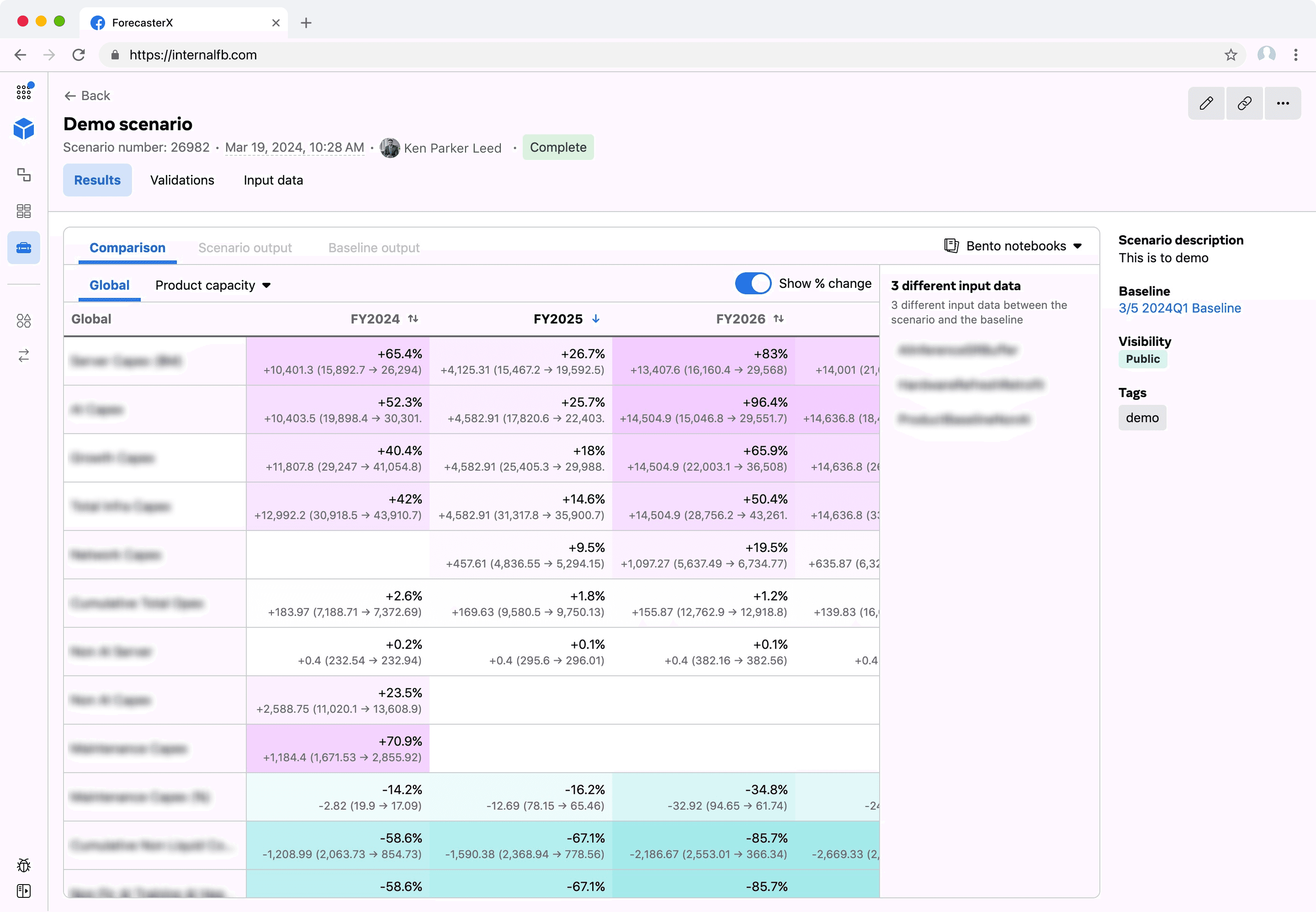
The results are shown on the bottom, broken down by "data type" dimensions, with the baseline numbers compared against the new forecasted numbers.
Challenge 1
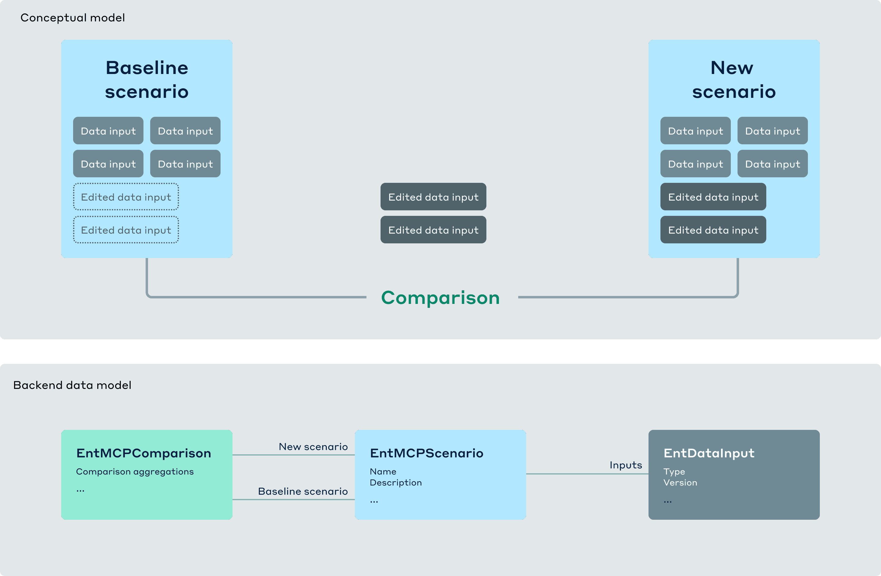
Simplify the conceptual model
As a designer and a naturally curious person, I like to understand how everything works.
Through documentation review, hands-on testing, Q&A with the team, and object-oriented analysis, I uncovered the core elements enabling forecast scenario creation. It was a lot of elements; I wasn't sure if they were all needed.
Model
Model run
Baseline
Version
Scenario
Input data
Stage
Canary run
Run ID
Diff
Model
Model run
Baseline
Scenario
Input data
Canary run
As I deepened my understanding by defining the elements with my engineering partners, we discovered overlaps that created opportunities for simplification.
Model:
Data inputs and outputs (output is a forecast)
Baseline:
A type of scenario
Scenario:
A model run
A canary run (this is what generates the delta between the baseline and new scenarios)
Using the OOUX framework, I confirmed possible transactional actions with the team, and mapped out the conceptual model consisting of objects, actions, and attributes.
OBJECTS
Baseline scenario
New scenario
ACTIONS
Create
Duplicate
Archive
Promote
Edit metadata
ATTRIBUTES
Metadata
Input data
Comparison
User-centered improvements
Refining the user flow
This project provided a few opportunities for bringing more thoughtfulness to the experience.
The scenario creation flow is pretty straightforward, as shown below. The most important part is allowing users to easily change input data, as this action reflects some infra, org, or financial changes they want to test for impact against the baseline forecast.

I refined the user flow with two key improvements:
Auto-saving that creates a draft as soon as users name their scenario, making work recovery more intuitive than using system IDs and preventing frustrating data loss during the complex creation process.
Public/private visibility controls allowing users to create private scenarios without worrying about their work-in-progress scenarios misconstrued as organizational or prioritization changes.
Challenge 2
Changing the input data
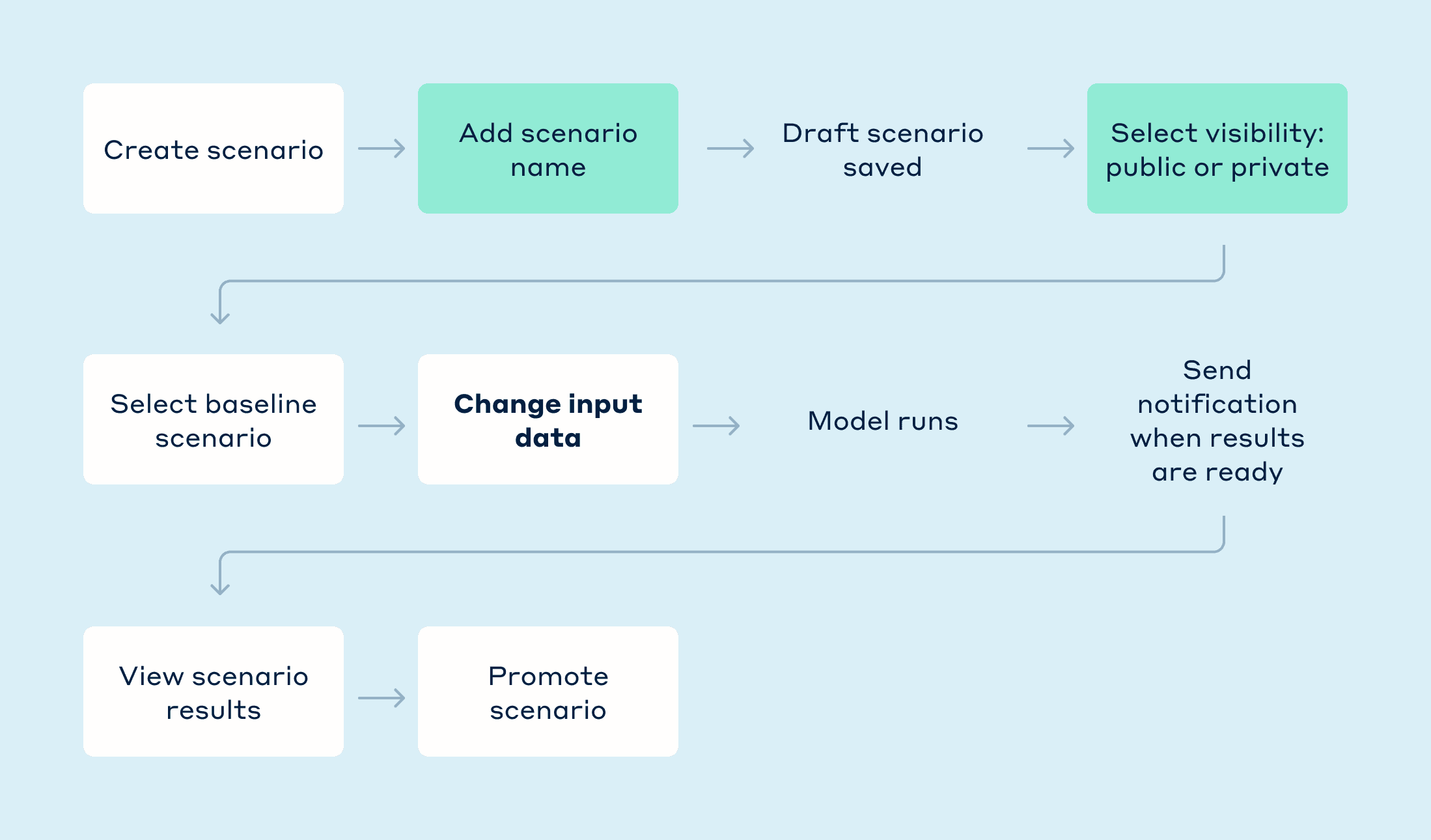
Creating what-if scenarios is seemingly easy:
Create a new scenario by adding a name and some metadata
Select a baseline and modify key inputs
Generate and compare results
But even a seemingly straightforward user flow can become complicated when details creep in. At first glance, scenario creation is seemingly straightforward. And the first step is pretty easy. Users select "Create scenario" to initiate the creation process, fill out the scenario name, select visibility, and click next.

The second step of selecting a baseline and modifying inputs proved more challenging, especially as requirements changed numerous times.
For the initial iteration, I adapted the proof-of-concept approach with an editable JSON interface and side-by-side comparison view to clearly display changes.
Select a baseline scenario to get its input data
Each input data has an editable JSON field on the right, in a comparison view formt.
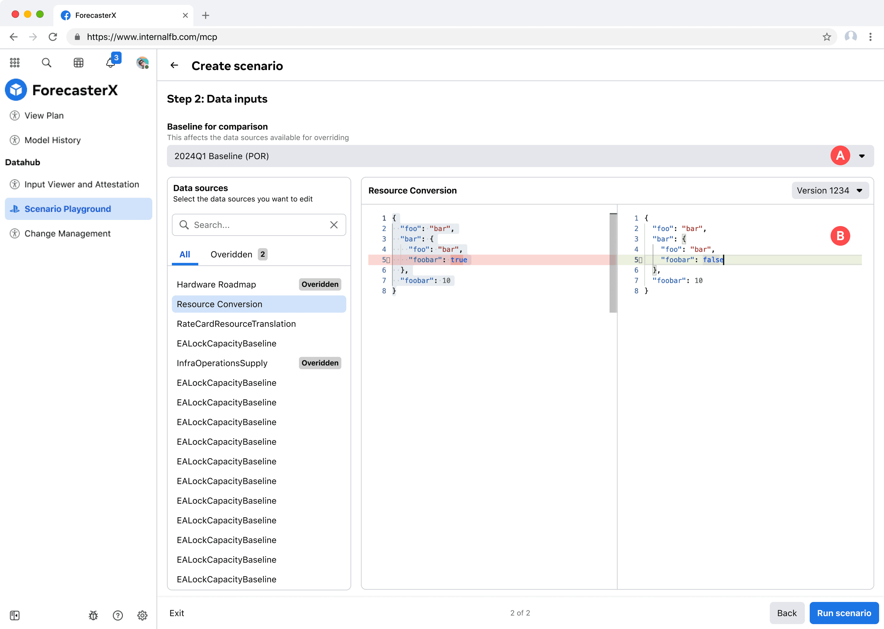
Requirements clarified. I learned that direct JSON editing wasn't possible for every input data. In fact, users must download the input data, edit it locally, and upload.


These early iterations has distinct areas for distinct functions. The left side for previewing and downloading input data. The right side for new input data. This creates visual complexity and wastes space.


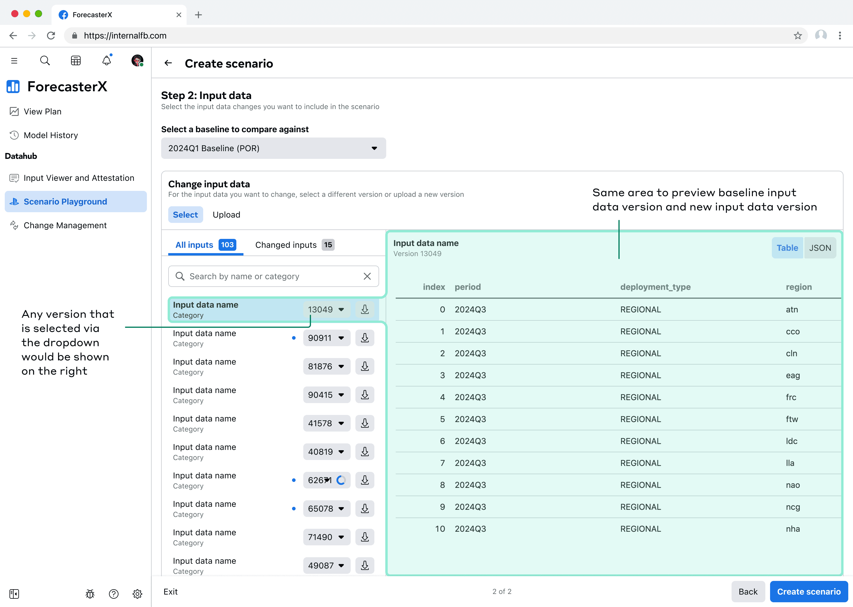
To help users navigate dense information while creating scenarios and selecting input data to change, I optimized for space efficiency and cognitive clarity:
The "Changed inputs" tab groups all modified inputs for quick review
The input data that's selected on the left is previewed on the right. As new versions are selected, the right preview would update.
Input data that has an updated version is indicated with a blue dot
Challenge 3
Visualizing scenario results
Scenario creation requires processing time. The underlying model needs several hours to generate forecasts based on the modified input data. The interface needs an in-progress state while results are being calculated.
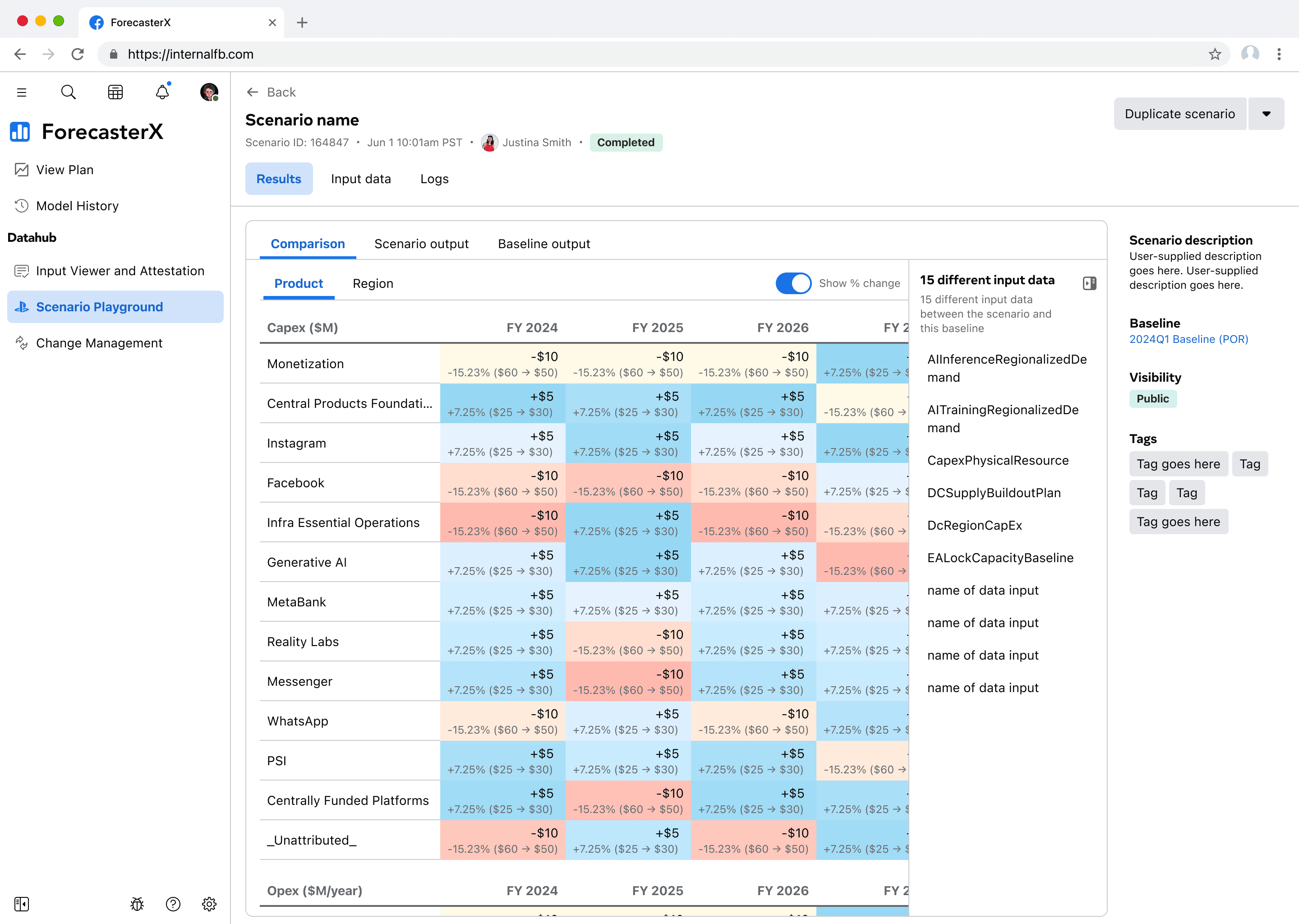
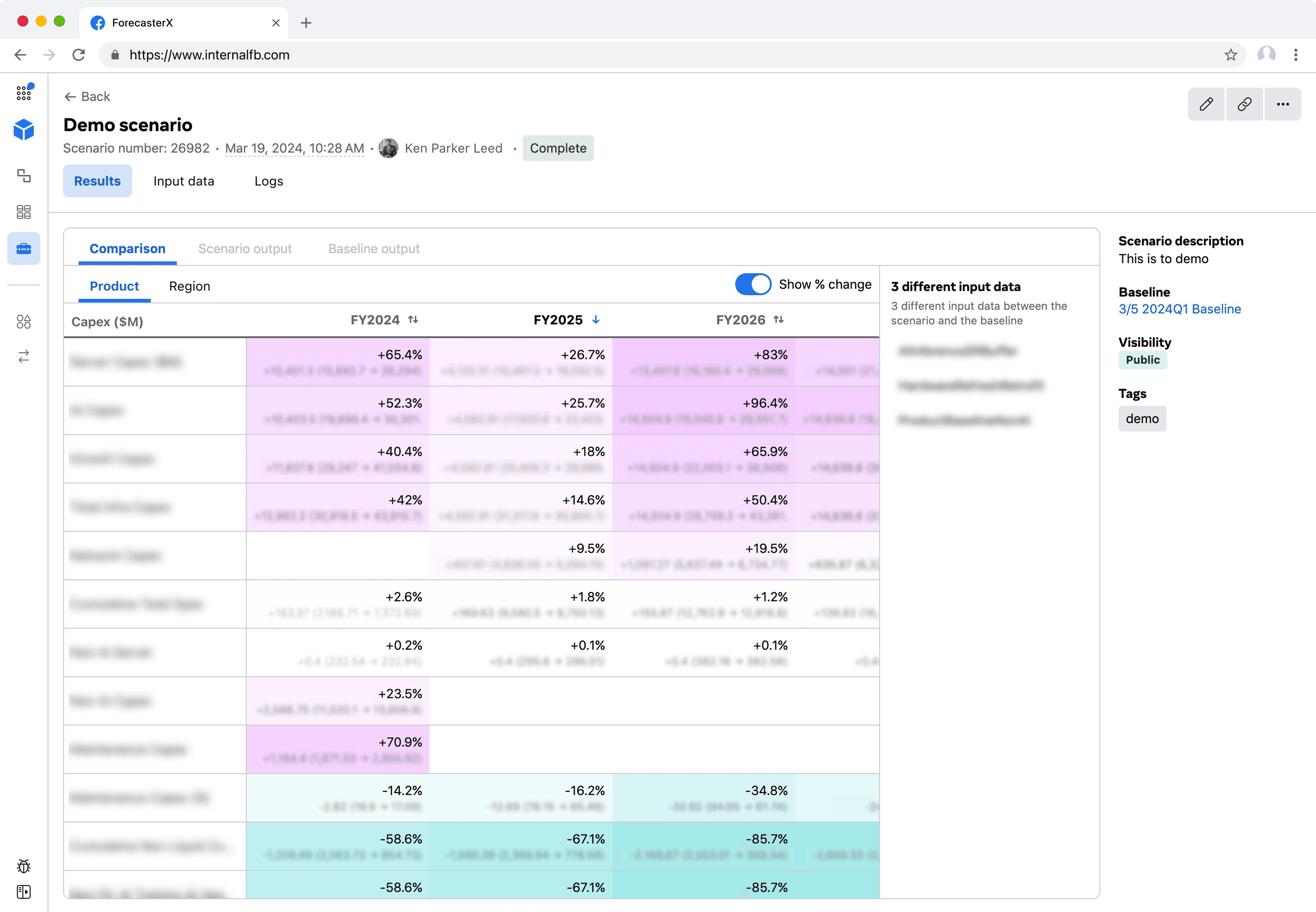
I initially placed the metadata (baseline scenario, modified input data, and scenario description) on the left. Later, I prioritized scenario results on the left and moved metadata to the right, recognizing users care more about outcomes than setup details.

How should actual scenario results be displayed? I gathered feedback from 3 users to understand their preferences. Why only 3? Due to ForecasterX's sensitive forecasting data, only 20-30 users have the necessary permissions to access it. The feedback revealed no consensus on visualization methods. It was clear users needed the ability to do further analysis elsewhere.
One user shared an example of a heat map she created in Excel to manually track changes in capacity forecasts. As you can probably guess, I took great inspiration from this.

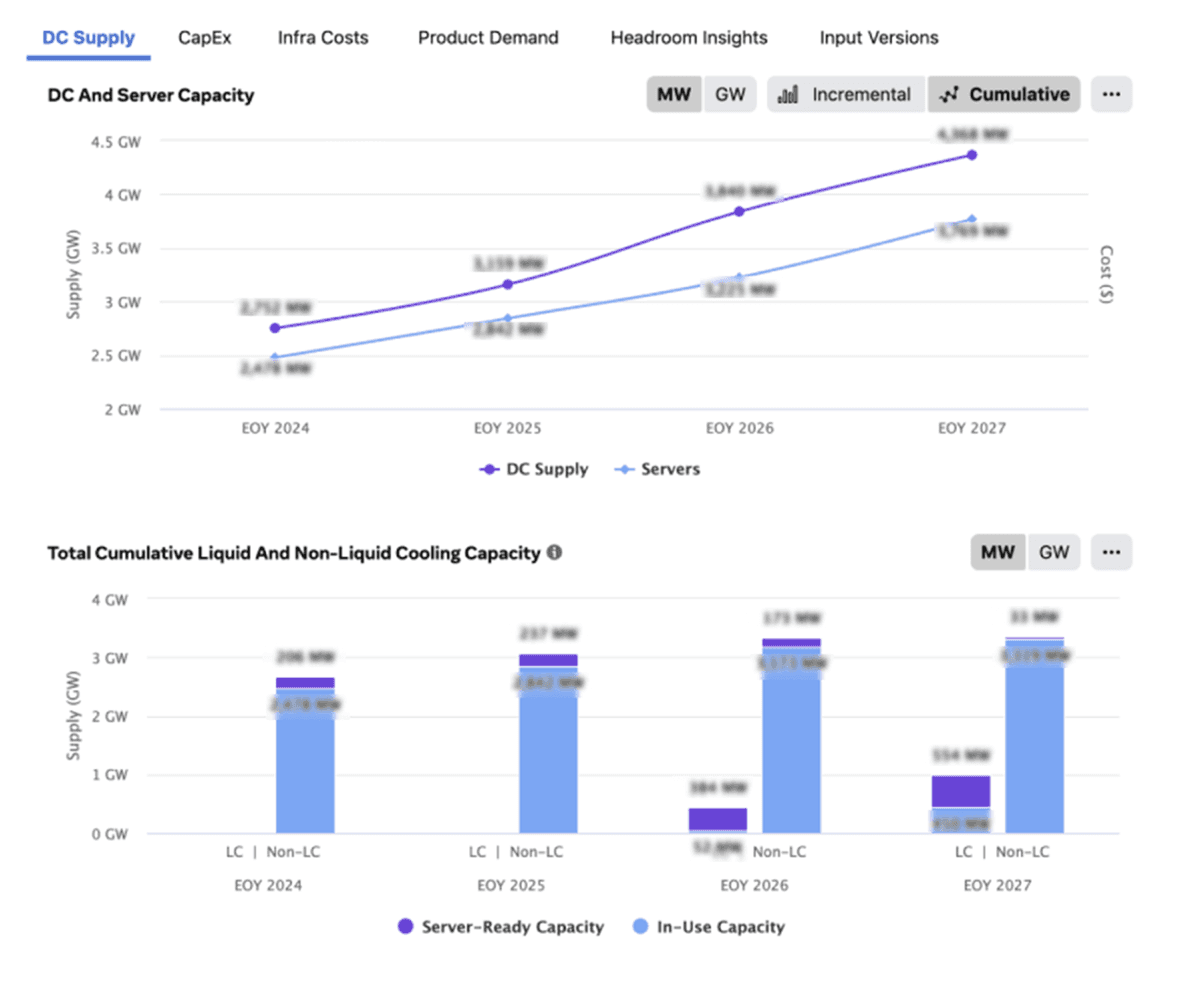
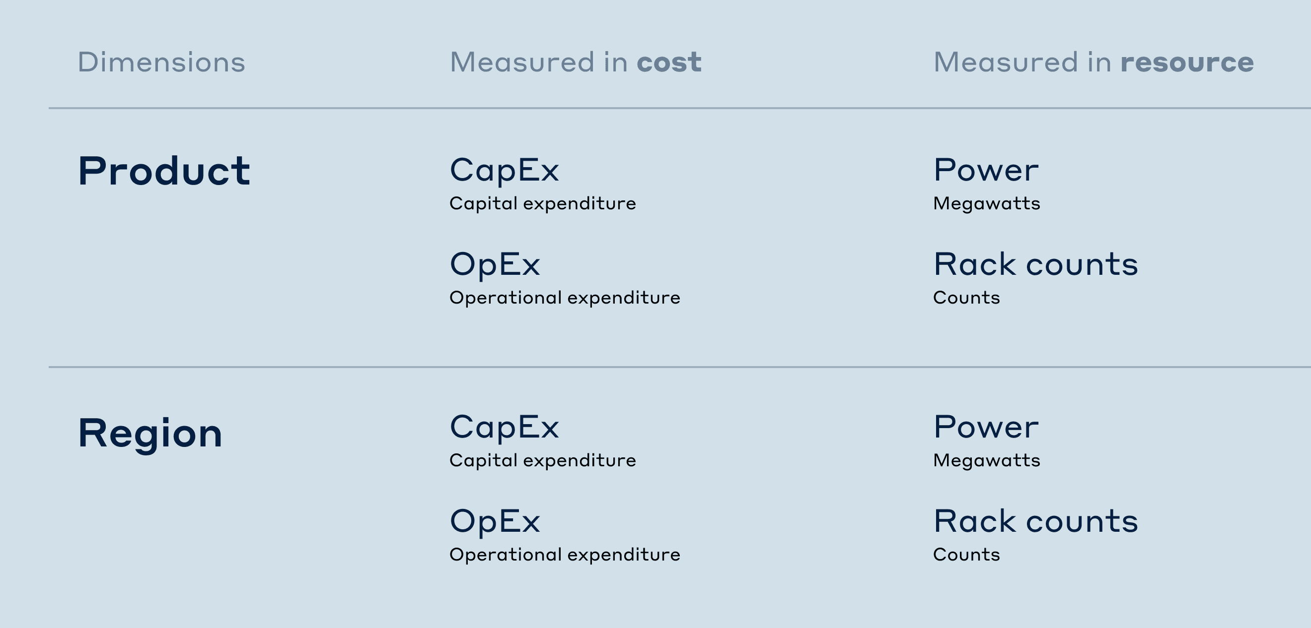
Research did reveal some agreement on the dimensions and measurements. Users wanted to view cost and resource breakdowns by product (FB, Instagram, etc.) and by regions of data centers.
For cost, they preferred dollar forecasts of CapEx (building/equipment investments) and OpEx (recurring expenses).
For resources, they prefer forecasted electricity (wattage) and server infrastructure (rack count).
My initial design used toggles to switch between product and region views. Within each dimension, there are a total 4 tables (CapEx, OpEx, Power MW, and Rack count). This creates a lengthy vertical scroll.


Users also mentioned a need to conduct custom analysis in other internal tools such as notebooks, so I ensured the results could be seamlessly opened in user's preferred analytical environments.

Although the primary user intent is to see how this new what-if scenario compares against the baseline, it's also important for them to see the raw output. For this, I leveraged the existing implementation so users do not have to learn a new visualization pattern and we didn't have to design and implement a new visualization.

Enhancing traceability
Debugging unexpected results
All three interviewed users emphasized the need to troubleshoot unexpected scenario outcomes. The most likely reason is because the updated input data was wrong or problematic.
The design highlights input data changes in two ways.
First, the results tab prominently displays the number of changed inputs for each scenario on the right-side of the page. I initially used expandable sections to enumerate all changes per input data, but this wasn't practical for users making multiple complex modifications.

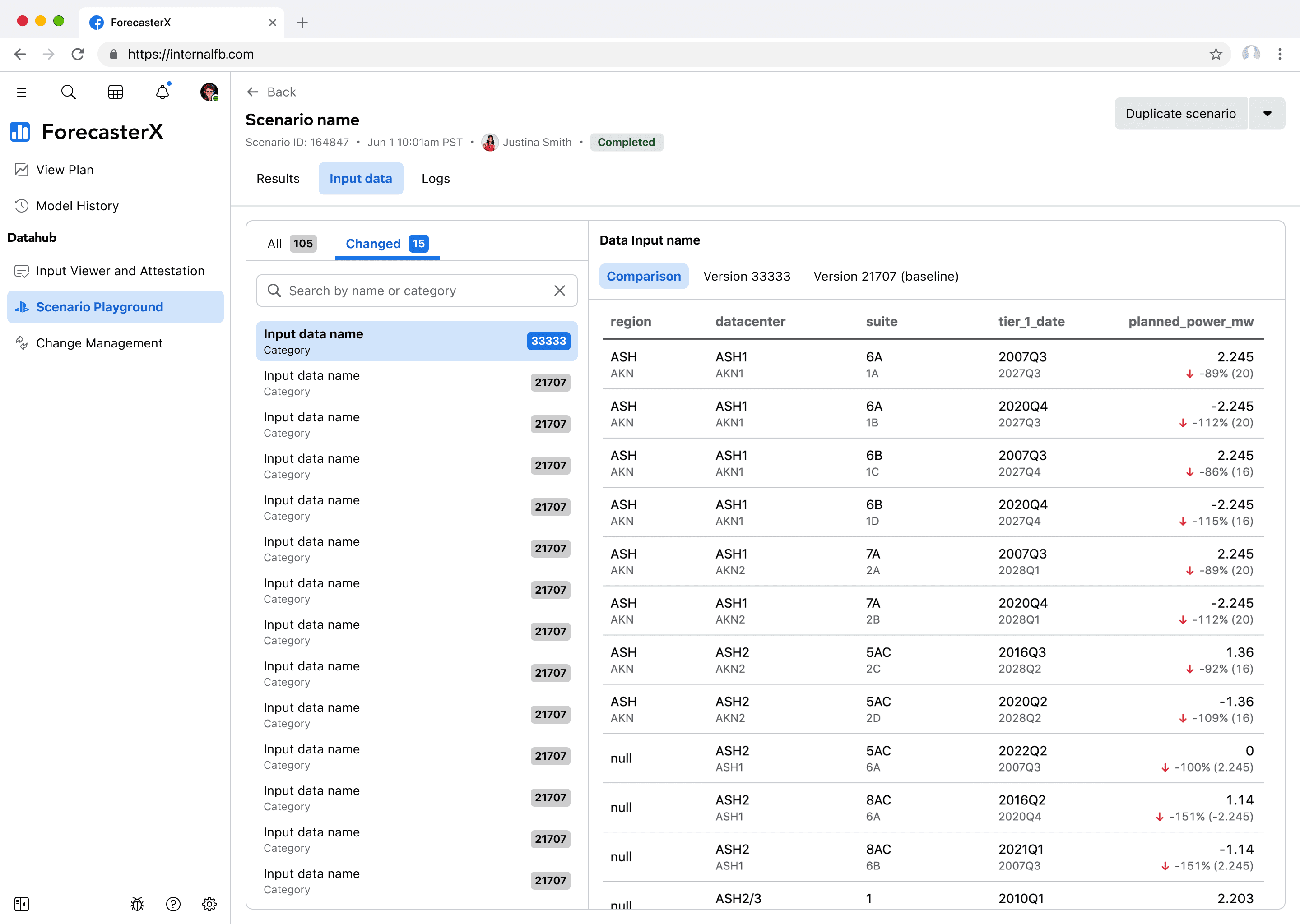
I simplified the design by removing version numbers and edit counts, as these aren't useful when several hours have passed since selection. Instead, each changed input is now interactive—clicking opens a modal comparing the current version of this input data against the baseline scenario's version of this input data. The chevron next to the input data name in the modal allows users to switch between any of the changed input data.

I then refined the design to use tabs. This allows users to see not only the comparison between input data versions but also the and the actual input data content.
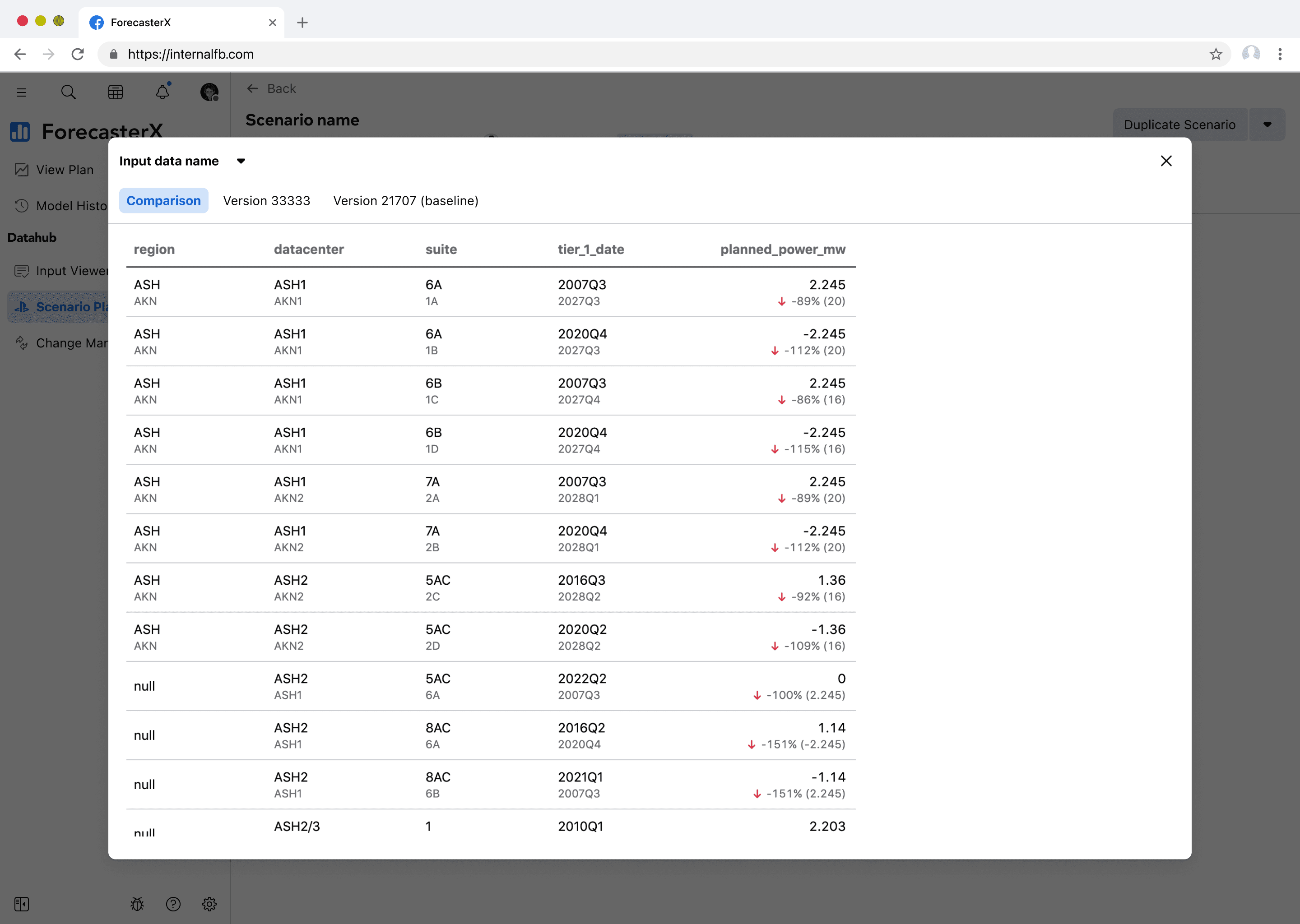
The second way the design highlights changed input data is through a dedicated input data tab next to the results tab. Here, users can easily view all of the input data as well as the changed input data. I intentionally leveraged the same 3-tab pattern of comparison, version X, version X (baseline) as seen in the modal.
Systemizing accessibility
It was early Feb 2024 and most of the design work was done. But stakeholders were concerned that the blue and orange color scheme carried unintended good/bad connotation. While the design system team proposed purple and teal as alternatives, I worried these colors' lighter hues might be difficult to distinguish for users with red/green color blindness

To address this color-accessibility issue, Initially, I explored a spectrum of opacity variations that would fulfill color-blindness needs. But research showed translucent colors pose unique challenges, with background colors significantly affecting contrast ratios.
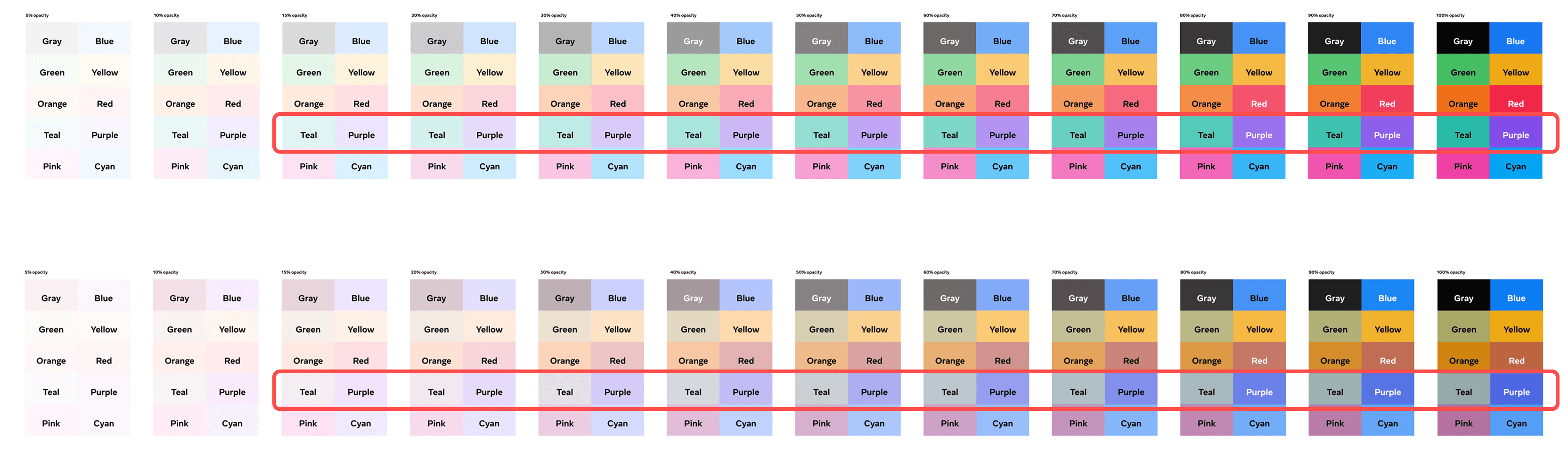
Rather than using opacity, the front-end engineer and I implemented a linear interpolation between the lightest and darkest acceptable shades of purple/teal for the cell backgrounds. Larger deltas use darker shades while smaller deltas use lighter shades of the respective colors.
We limited our color palette to shades that work with dark text only, avoiding the need to invert text color on darker backgrounds and reducing programmatic complexity

After this project, I proposed a heat map component for the design system that leveraged this approach.
Measuring impact
Architecting the back-end
I successfully applied object-oriented UX to simplify complexity, influencing both interface design and backend architecture—unlike typical projects where design follows technical limitations.
One example: the team renamed generic "runs/run IDs" to "scenarios" throughout the codebase to better match user mental models.
Time. Time. Time.
The modus operandi of internal tools is to increase efficiency; time-savings is the name of the game. Finance teams previously relied on engineers to implement data changes and run the model—typically a 24-hour process.
With scenario workbench automation, this now takes about four hours, reducing turnaround time by over 80%.